
The other day, I reviewed my ideas for MMS Flamingo sessions and considered dedicating a whole session to Power BI Tips and Tricks. During this process, I assessed my existing blogs and identified the need to update or create new ones. I noticed that my blogs are written in a project-based format, spanning multiple topics over a few weeks. In light of this can make it challenging to find posts on specific subjects. Therefore, I decided to create a single blog post that compiles all the Power BI Tips and Tricks for easy access.
Power BI Tips and Tricks
Before diving in, I want to clarify that when I mention Power BI tips and tricks, they pertain to both Power BI Desktop and Power BI Report Server. It’s worth noting that many tips applicable to Power BI Desktop also extend to Power BI Report Server. However, I will focus more on Power BI Desktop or Dashboard topics verse more Power BI Report Server topics.
In short, I’ll showcase several of my previous blogs. I believe many of these blogs require updates. Which ones do you think should be prioritized for updates?
Labs
These posts are eBooks featuring labs or upcoming labs that will be included in the eBook. They are created to assist you in learning how to execute the steps needed to build your own reports.
Navigating Intune Reporting: Elevate Your Reporting Skills with Power BI
This blog is the starting place to download the eBook. Which focuses on enhancing Intune reporting skills using Power BI. It covers strategies to effectively navigate Intune data in Power BI reports, providing practical tips and step-by-step guidance for improved reporting capabilities.
Navigating Intune Reporting with Power BI Conditional Formatting
The lab discusses using Power BI conditional formatting to navigate Intune reporting effectively. It explains how to apply conditional formatting to visualize and analyze Intune data in Power BI reports, offering step-by-step instructions and tips for efficient reporting.
Intro Power BI Tips and Tricks
Everyone has a starting point, and these blogs serve as your introduction to each topic. What other topics would you like me to cover?
Step-by-Step Guide: Installing Power BI Desktop
In effect, this post gives a step-by-step guide on installing Power BI Desktop. It covers system requirements, downloading from Microsoft’s site, running the installer, and troubleshooting common issues. It’s a handy resource for those new to Power BI Desktop installation.
Power BI Filters
The post delves into Power BI filters, explaining their role in refining and analyzing data within reports. It covers different types of filters, such as visual, page, and report-level filters, along with practical tips on their implementation for effective data visualization.
Power BI Slicer
The article discusses Power BI slicers, which are interactive controls that filter data in reports. It explains how to add slicers, customize their appearance and functionality, and offers tips on using them effectively for data analysis and visualization.
Adding a Chart to a Power BI Dashboard
The blog explains how to add a chart to a Power BI dashboard. It provides a step-by-step guide on selecting the appropriate chart type, configuring data fields and visualization settings, and placing the chart on the dashboard for data analysis and presentation.
Understanding Power BI
Understanding Power BI is crucial, not just in creating dashboards but also in navigating its quirks. These topics shed light on some of those quirks and provide strategies to overcome them effectively.
Power BI Drillthroughs – How Do They Work?
The post discusses the functionality of Power BI drill-throughs, explaining their purpose in data analysis and how to implement them in reports. It provides a detailed guide with step-by-step instructions, screenshots, and examples for a better understanding of drill-throughs in Power BI.
Power BI Title Padding Work Around
In particular, this article offers a workaround for adjusting title padding in Power BI reports. It explains how to use a text box with spaces to create padding around titles, providing a step-by-step guide and visuals to help users implement this workaround effectively.
What Are the Differences Between a Power BI Slicer and A Filter?
This topic highlights the distinctions between Power BI slicers and filters. It explains how slicers visually filter data in reports, offering interactive selection options, while filters operate behind the scenes with more complex conditions. The post clarifies when and how to use each feature for optimal data analysis in Power BI.
Slicer and Filter Conflict
The article addresses conflicts between slicers and filters in Power BI reports. It explains how overlapping slicers and filters can lead to unexpected results and offers solutions to resolve these conflicts effectively, ensuring accurate data visualization.
Unexpected Power BI Results? Turn Off the Keep All Filters Option
In short, this topic discusses a solution for unexpected results in Power BI by turning off the “Keep all filters” option. It explains how this option affects data visualization and provides step-by-step instructions on where to find and disable it. This tip can help users troubleshoot and improve their Power BI reports for more accurate insights.
Power BI Drillthrough Filters and How to Change Them
The article covers Power BI drill-through filters and how to modify them. It explains the purpose of drill-through filters in analyzing specific data subsets and provides a step-by-step guide on changing and customizing these filters within Power BI reports for more focused insights.
How Color Is Used in Power BI and SSRS Dashboards
The topic explores the use of color in Power BI and SSRS dashboards. It discusses how color choices impact data visualization and user experience, providing insights into best practices for using color effectively to convey information and improve dashboard readability.
Advance Power BI Tips and Tricks
Despite Power BI quirks, it also is very powerful! These group of posts can take your dashboards to the next level.
How to Create a Power BI Date Range Slicer
The blog explains how to create a date range slicer in Power BI. It provides step-by-step instructions, including adding a slicer, configuring date range options, and applying the slicer to visualizations. The post aims to help users filter data by date effectively in their Power BI reports.
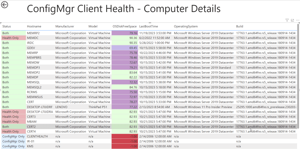
How to Add a Card to Display the Total Number of Computers in a Power BI Table
While this article details how to add a card in Power BI to display the total number of computers in a table. It provides a step-by-step guide, including creating a new card visual, adding the appropriate measure to display the count, and customizing the card’s appearance. The post aims to help users enhance their Power BI reports by showcasing specific data metrics prominently.
How to Add the Last Refreshed Date and Time to a Power BI Report
The blog explains how to add the last refreshed date and time to a Power BI report. It provides a step-by-step guide, including using Power Query Editor to create a custom date and time column, and then displaying this information on a report page. The post helps users ensure their reports reflect the most recent data refresh.
How to Display Version Number Info on Power BI Reports
Then this guide outlines how to display version number information on Power BI reports. It includes a step-by-step guide on adding a version number column, creating a slicer for version selection, and incorporating this information into report visuals. The post aims to help users track and display version details effectively in their Power BI reports.
How to Create Power BI Parameters
The blog details the process of creating parameters in Power BI. It offers a step-by-step guide on defining and using parameters to enhance report interactivity and flexibility. This feature allows users to dynamically adjust data visualizations based on selected criteria, improving data analysis capabilities in Power BI reports.
Adding a Calculated Column to a Power BI Table
The blog details the process of adding a calculated column to a Power BI table. It offers a step-by-step guide on creating a new column using DAX formulas to derive values based on existing data in the table, enhancing data analysis and visualization capabilities within Power BI reports.
How to Create a Visual Filter in Power BI
This post explains how to create visual filters in Power BI. It covers adding filters to reports, customizing settings like slicers, and offers best practices for effective filtering. Great for those wanting to improve data visualizations in Power BI.
Intune
The forthcoming articles will delve into topics that intertwine Intune with Power BI, offering insights and strategies that bridge the two platforms.
How to Leverage Intune Data and Write a Basic Power BI Report
The blog teaches how to use Intune data to create a basic Power BI report. It covers steps like connecting to Intune data, selecting relevant fields, designing visualizations, and creating a report layout. The post provides a beginner-friendly guide with practical tips for leveraging Intune data effectively in Power BI reports.
How to Create an Intune Data Warehouse Readers Group
Basically, this guide provides a guide on creating an Intune Data Warehouse Readers group. It covers the steps to create this group in the Azure portal, assign permissions, and manage access to Intune data warehouse reports effectively.
Odds and Ends
Since these topics don’t neatly fit into the other sections, I’ve designated a separate section specifically for them.
SSRS and Power BI Report Standards
The blog discusses standards for SSRS (SQL Server Reporting Services) and Power BI reports. It covers aspects like report design, layout, formatting, data visualization, and user interaction. The post provides guidelines and best practices to maintain consistency and quality reports, ensuring effective communication of data insights.
How to Create Power BI Templates
Additionally, this post explains how to create Power BI templates, which are reusable report structures with predefined data connections and formatting. It provides a step-by-step guide on designing a report template, saving it as a .pbit file. And sharing it with others for consistent reporting across teams or organizations.
Do you have a Topic idea?
I’m currently testing out an idea for a feedback site where you can submit topic ideas. To help reduce spam, you’ll need to provide your email address. Rest assured, I won’t spam you, but you might receive an email once the blog is closed and scheduled for release. Although I haven’t tested that yet.
Please keep in mind that my focus is primarily on inventory and reporting topics. While I can’t guarantee that I’ll cover every topic submitted, providing more details increases the likelihood that I or a colleague might address it.
Feel free to submit your topic through the new portal site at https://blogs.sleekplan.app/. Does this work for blogs? Let me know.
If you have any questions about Power BI Tips and Tricks. Please feel free to contact me @GarthMJ Please also subscribe to my YouTube channel and newsletter.