Last updated on April 27th, 2024 at 09:40 am
Hi Everyone! Today I am talking about How to create a visual filter in Power BI and how to set them up. This post is part of a series of blog posts that we’ve done at Enhansoft about the different types of Power BI filters.
Visual filter are useful for refining data on a report canvas in charts, tables, etc.
Visual filters are helpful tools because they:
– Help you refine a specific data object or category.
– Allow you to have multiple visuals displaying different data objects.
– Make it easier to get rid of irrelevant data.
– Operate in the background, so they don’t need any real estate on the canvas.
Reviewing Visual Filters
I am going to use Enhansoft Reporting’s TLS (Transport Layer Security) dashboard as my example. Below is the end result I want to see.
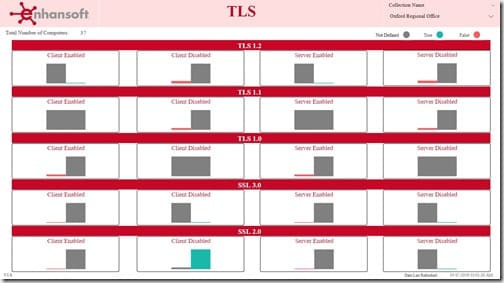
This report shows me individual bar charts with the count of computers for clients and servers. They either enabled or disabled, for each of the five different protocols.
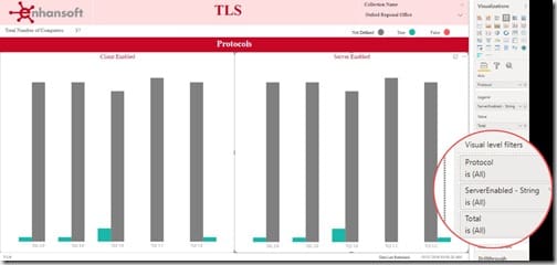
In the above image you see how this report initially looked. The protocols were listed under each bar. Again, they enabled clients (Client Enabled) on the left-side and enabled servers (Server Enabled) on the right-side. This dashboard wasn’t the easiest to read. Check out the magnified section in the image which shows that, currently, there are no visual filters applied. Obviously, I needed to adjust the appearance of this dashboard, so using visual filters was the perfect solution.
How to Create and Configure a Visual Filter
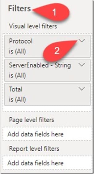
When you add columns to a chart, the visual filters under the Visualization Pane are automatically populated with the same columns as the chart. In this example, I am only showing you the steps I took for enabled servers (Server Enabled). You can see in the above image under the Filters (#1) section, that Visual level filters are populated with the columns from my dashboard’s chart associated with enabled servers: Protocol, ServerEnabled and Total.
I first start by clicking on the Protocol drop-down (#2).
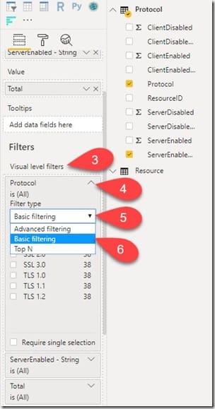
Just to be clear, in this report there are five different protocols. I want to know the count of computers with a particular protocol (enabled or disabled) on both the client side and the server side. Starting from the Visual level filters pane (#3), I am linking each protocol to the appropriate enabled server bar chart.
Next, use the drop-down arrow (#4) on the column you want, in this case it’s Protocol, in order to reveal all of the filtering options (in other words, the five different protocol versions).
Under Filter type, I click on the drop-down arrow (#5) and choose Basic filtering (#6) from the list.
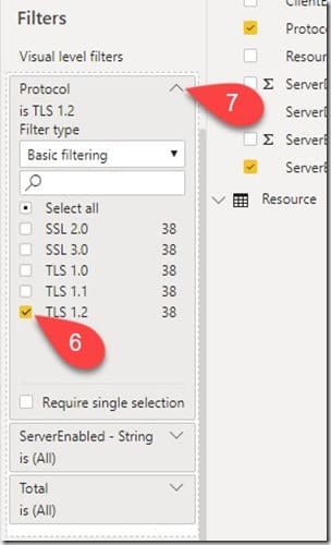
Next, I choose the appropriate protocol (#6) to be filtered from the list. Once the protocol is selected, the bar chart is instantly updated and displays the result on the canvas. I close the menu by clicking on the top-arrow (#7). I then repeat the same steps for each bar chart/column associated with the protocol, TLS 1.2.
Results
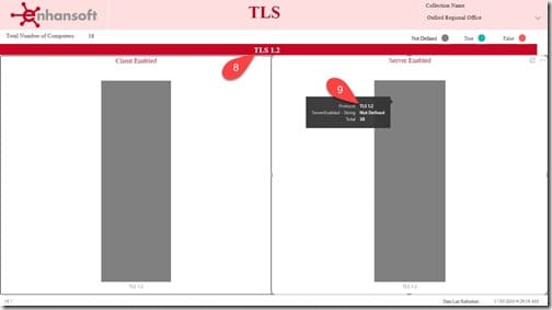
The above image confirms that the bar charts under the section TLS 1.2 are filtered to display the correct protocol – that is TLS 1.2. The title bar (#8) was renamed TLS 1.2 and new title bars for each protocol section were later added. You can also see the protocol details (including the count of computers – Total) in the tooltip when you hover over either of the bar chart columns (#9). Next, the two remaining options (disabled servers and disabled clients) were added as charts in order to complete the final layout.
When I finished setting up the visual filters for TLS 1.2, I turned my attention to TLS 1.1. And linked that protocol to each of the enabled servers, disabled servers, enabled clients, etc., columns. Then it was TLS 1.0 and on and on. Until the dashboard looked like the first screenshot in this blog post. You get the picture!
This is how you create and configure visual filters.
Conclusion
In the Enhansoft TLS report set we wanted to show the number of computers associated with each protocol along with their server/client state in a bar chart. We achieved all of this by using visual filters!
At Enhansoft, we use visual filter in almost all of our reports. Now that you know how-to, you have no excuse not to use them too! Hope y’all find this useful while creating your reports. For any questions regarding this topic, please feel free to reach out to me on Twitter @SuaresLeonard. Finally, don’t forget that you can subscribe to my RRS feed to stay on top of the latest trips and tricks. Till then good luck.
