Last updated on April 27th, 2024 at 10:13 am
Hi Everyone! This blog post is about how to create and use a date range slicer. I am also going to tell you about the different date range slicer options and each one’s purpose, but first let me share with you why I wrote this post. Earlier this year, I created a date prompt on an SSRS report that’s called, List of Computers by Warranty Checkdate. After completing that task, I also wanted to do the same thing in the Power BI version of that report. I didn’t have much experience creating SSRS date prompts. I certainly had no experience when it came time to create this type of prompt in Power BI too. So I began another new exploration.
Even though both SSRS and Power BI are from Microsoft, and are both used for reporting, they each come with a unique set of elements in order to accomplish the same task. If you look at last week’s blog post, How to Create a Date Prompt in SSRS, it was simple for me to create the date prompt. Power BI, I soon discovered, does not have the same calendar date feature, but IMO it offers something even better than what you get with SSRS.
Date Range Slicer Options
Normally, a Power BI slicer has two options; one is a list option and the other is a dropdown. There’s a catch, however, to these slicer options. Depending on what datatype is used with the slicer, there can be additional options that come into play. In my case, I won’t be using a list or a dropdown. I am going to use a date range slicer with a horizontal scroll bar!
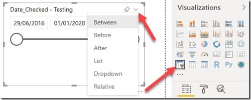
Add a date range slicer to the canvas. If you click on the down arrow (shown in the image above) you can see all of the available options.
- Between – the user is given a date range between a start and an end date with a horizontal scroll bar.
- Before – there’s an option to pick a date before a certain end date or the end date itself with a horizontal scroll bar.
- After – gives the user an option to pick a date after a start date or the start date itself with a horizontal scroll bar.
- List – a date must be picked from a list of given dates using check boxes.
- Dropdown – the user must pick a date from the dropdown list for dates with a check box.
- Relative – you can select the, “Next,” “Last,” or, “This,” date for any count of days, months or years. This option gives you a lot of flexibility!
In the end, I decided that the Between option best-suited my needs. So I am going to show you how to setup that option.
How to Setup the Date Range Slicer
Before continuing, I want to quickly explain what the WIR checkdate column is all about. Because this is the report column that I am using in this example. The WIR checkdate is when a computer checks its warranty status with Enhansoft’s Warranty Status API. This field is not normally seen by anyone and it is mainly used for informational purposes.
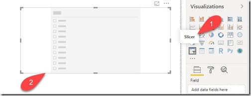
Begin by selecting the Slicer (#1) icon from the Visualizations pane. Then placing it on the canvas (#2) as shown in the above image.

Drag the date column (#3) from the dataset (in my case it’s WIR checkdate) and place it in the Field section (#4) of the slicer. The slicer automatically picks up the start date and the end date from the date column and adds the column name to the slicer heading as a title (#5). In this case it’s, “Date_Checked.”
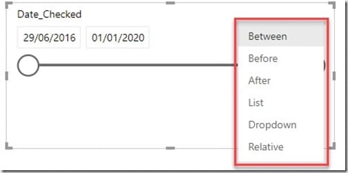
By default, the slicer displays the date with the Between option. So I don’t need to change a thing at this point. After further investigation, I must say that it’s also the easiest option to use because the dates are auto-populated and it does not need any manual configuration. It displays the start and end date with a horizontal scroll bar which you can use to select a range between the two dates.
If you want to use another option, it’s a very straightforward approach. Simply select another slicer option of your choice from the list.
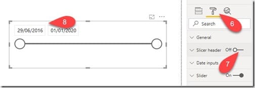
Back to this report, I still have work to do. I need to resize the slicer on the canvas by turning the slicer heading off and minimizing the space it takes. To turn off the slicer heading, Select the Slicer then go to the Format option (#6) . Next, turn the Slicer header option (#7) Off. You can also verify it’s off on the canvas (#8).

I also need to add a description in order to let the user know what this slicer is all about. My title, “Date Range,” uses a text box/card combo. If you’d like to do the same, check out my blog post, How to Add the Last Refreshed Date and Time to a Power BI Report. For more details and refer to the section, Single Line Option – Text Box/Card Combo. Finally, I updated the background color to match the rest of the title area.
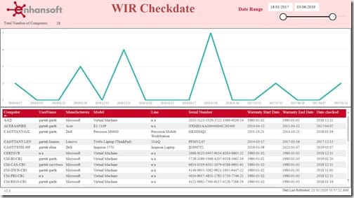
Above, are the results that I wanted to see in this new Warranty Information Reporting (WIR) report. Notice that I selected a date range by moving both slicer buttons towards the middle? The user can do the same by simply sliding the buttons between the dates in order to select the desired date range. Power BI is among one of the smartest reporting tools out there and I especially like its ability to transform data.
Now that I finished creating my first Power BI date range slicer. I had an epiphany to do the same on SSRS reports. You need to wait until next week in order to see how I did it!
Conclusion
Power BI and SSRS have their own perks and quirks for creating reports. One application makes it easy and simple to accomplish a task whereas the other one doesn’t. However, if you take the time to research and improvise with Power BI. You can surely find the right approach to give you exactly what you want! Hope ya’ll find this idea useful. For any questions about this blog post, leave a comment here or you can reach out to me on Twitter @SuaresLeonard. Don’t forget that you can subscribe to my RRS feed to stay on top of the latest trips and tricks. Until next time, good luck.
