Last updated on April 27th, 2024 at 10:23 am
In this blog post, I discuss in brief, the Power BI Slicer, sharing some of my experiences while working on Enhansoft Reporting’s new Microsoft Office Power BI dashboard. The main objective of this dashboard is to make it easy for our customers to see everything they need to know about their installed Microsoft Office software.
Introduction to the Power BI Slicer
A Power BI Slicer is an on-canvas visual filter; it is a powerful and smart way to filter out data. For our reports we want to allow clients to filter details by collection. This is easy to do in SQL Server Reporting Services (SSRS) because you can use a prompt to filter collections. You can do it the same way in Power BI too, however, if you want to move easily back and forth between collections, using a slicer is better than using a prompt.
There are many features that you could use to configure the slicer. It all depends on your requirements. In this post, I’ll show you some of the features that I used while creating Enhansoft Reporting’s Microsoft Office dashboard.
List or Dropdown?
First, you need to decide how the data filter will appear on your dashboard.
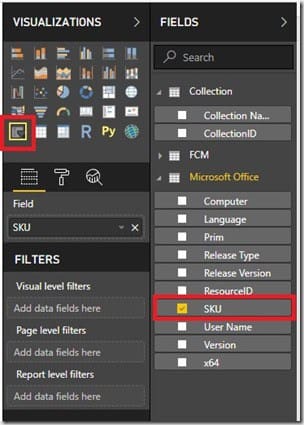
Choose the slicer icon from the Visualizations pane and place it on the canvas. Once it is on the canvas, choose the column from which you wish to filter out data. Instead of starting off with collections, in this case, I chose, SKU (stock-keeping unit).
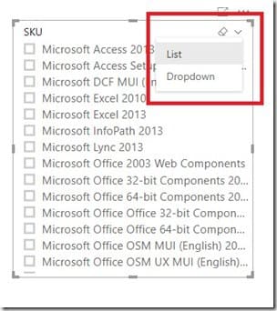
Back on the canvas, select the slicer icon. By default, it shows up as a list, but you can change it with one easy step. In the top right-hand corner, you see a downward arrow. Simply click on it and two options appear: List and Dropdown. If you don’t want the data filter to appear as a list, then select Dropdown. That’s it. I also want to work with a dropdown, so I selected that option.
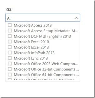
Once this option is chosen, the slicer panel layout changes. Now, a dropdown box appears with the All option.
Tip: The dropdown option uses less space on the canvas than the list, and it can be positioned someplace convenient in order to locate it easily.
Selection Controls
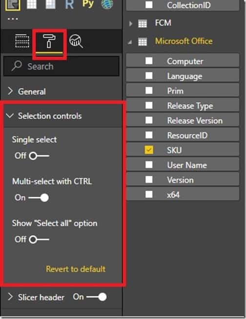
Depending on how you want your slicer to work, there are a few selection control settings that you can update. By default, Power BI slicers allow you to select multiple items, but this isn’t always optimal. In my report, I want an end-user to be able to select a SKU and then only see those computers with that specific SKU (product name). Notice in the above screenshot that the default setting for the Single select option is “Off?” Therefore, I need to change this default behaviour.
From the Visualizations pane, click on the format icon. The second option, Selection controls, displays the selection options. I turned “On” the Single select option and below is the end result if a customer was to select the Microsoft Access 2013 SKU.

Data Availability
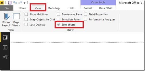
Once the slicer is populated with data, you can make it available across all pages or just a few chosen pages. To do that, click on the View ribbon and checkmark the Sync slicers option.

The pane above appears on the right-hand side of the canvas, to the left of the Visualizations pane. Here you see all of the pages created on this report. Simply select the pages on which you wish to sync ![]() the slicer and make it visible
the slicer and make it visible ![]() on the report page.
on the report page.
Re-Naming the Power BI Slicer
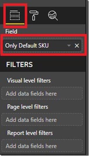
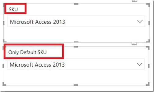
It’s important to give the slicer an appropriate title for users to easily identify its purpose. By default, Power BI takes the column header name for the slicer’s title. In many cases, you will want to add more detail for your slicer titles.
Tip: Do NOT rename the columns in the Field section. Instead, rename column headers under the Visualizations pane. Doing so does not affect the dataset. The screenshots below show you the before and after result of renaming the slicer title.
Finishing Touches

After I decided upon the dropdown option, updated the selection controls, defined the data availability and renamed the slicer, the last step for me was to add the finishing touches.
In the above screenshot, you can see that I created two slicers: one for SKUs and the other for collections. Both use borders and you might not notice this, but I edited the background so they blend perfectly into the dashboard. The way they appear above is synced and visible across all of the other pages in this set.
Power BI Slicer Conclusion
Power BI Slicers filter data results which makes the end-user experience more convenient. I mainly use slicers within Enhansoft’s Power BI reports to filter computers by collection or to display a particular value on a report page. Taking the time to adjust the appearance of slicers, however, makes the reports look better and more presentable. In my case, it gave me more real estate to work with for the other sections of the page.
Did you know there is a Power BI marketplace page? If you don’t like what slicer options exist out-of-the-box right now, check it out. https://appsource.microsoft.com/en-us/marketplace/apps?search=slicer&page=1
How are you using slicers within your reports? Let me know of your creative ways! If you have any questions about Power BI and slicers, you can reach out to me in the Power BI community forums or via my Twitter account @SuaresLeonard.
