Last updated on April 27th, 2024 at 10:32 am
Previously, building on the steps shared in my blog posts, How to Install Power BI Desktop, Getting Started with Power BI Desktop and SCCM, and Adding a Calculated Column to a Power BI Table, in this post I will be adding a chart to a Power BI dashboard. Given that, it might be helpful for you to review the previous blog posts to see how we got to this point.

Again, as a reminder, this is what our Power BI canvas looks like now.
Adding a Chart to a Power BI Dashboard
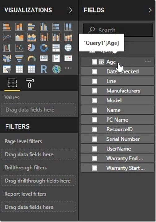
After that, start by selecting the Age column for Query1.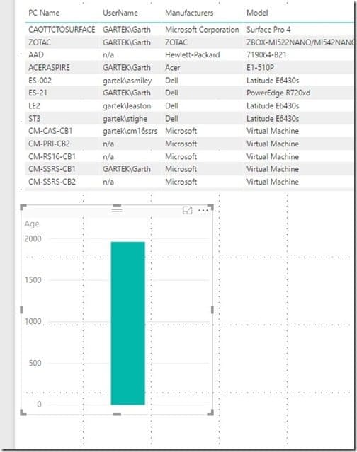
Drag the Age column to an empty area on the Power BI canvas. Notice how Power BI automatically selects a bar chart for you. Congratulations! You now have a chart on your dashboard. Wasn’t adding a it easy? Okay, I hear you, as it stands it isn’t that useful, but wait for it!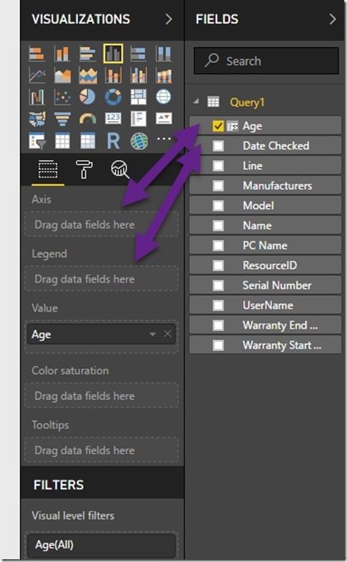
Drag the Age column to the Axis and Legend area under the VISUALIZATIONS section.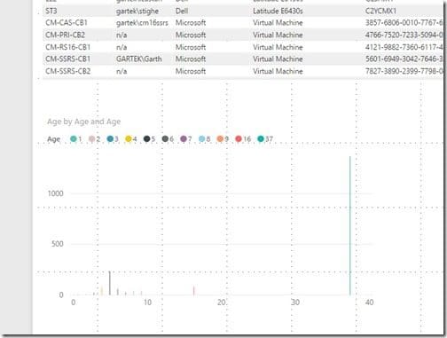
In real-time the image changes as you drag each item to the VISUALIZATIONS section! In order to make this chart easier to read, I modified it by re-sizing it. Look for the steps on how to do this later on in this post.
How to Change a Chart Style
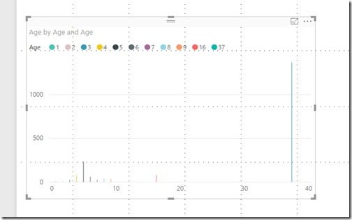
First, on the canvas, ensure that the chart is selected.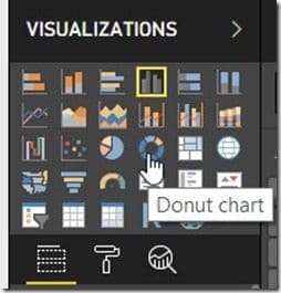
Then in the VISUALIZATIONS section, click on the new style you want to use for your chart. In my case, I want my chart to be a Donut.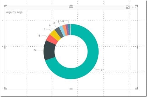
Likewise, again in real-time, as I select the chart style, I see it updated to the donut style. This is great because I can try out different styles quickly and easily.
How to Change the Title of a Chart
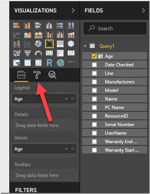
After that, select the chart in the VISUALIZATIONS section. Next, select the paint roller.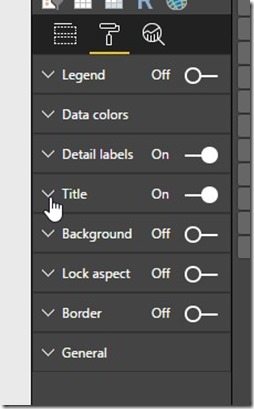
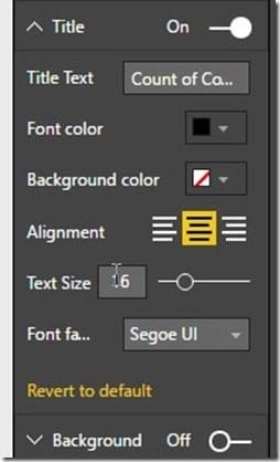
Update the text in the Title Text area. In my case, I changed the title to Count of Computers by Age.
I also made the following changes:
Font color to black.
Alignment to center.
Text Size to 16-point.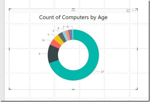
As can be seen, this is what my canvas looks like now. I like it!
How to Turn on the Chart Legend
A chart legend is handy to have if you’d like to know what each color represents.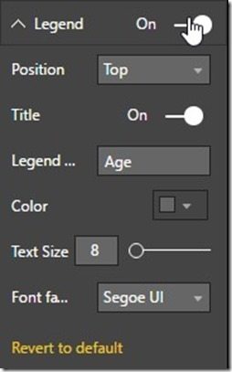
Again, select the chart in the VISUALIZATIONS section and select the paint roller. Click on the On button next to Legend and then click on the Legend expander.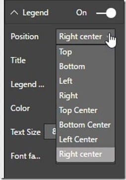
I want the legend to appear in the middle on the right-hand side of my chart, so I’m going to select Right center in the Position dropdown.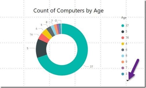
As a result, now looking at the image and notice that there is a down arrow.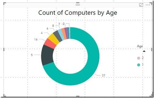
After that, clicking on the down arrow reveals that there are extra values. Isn’t that neat?
How to Resize a Chart
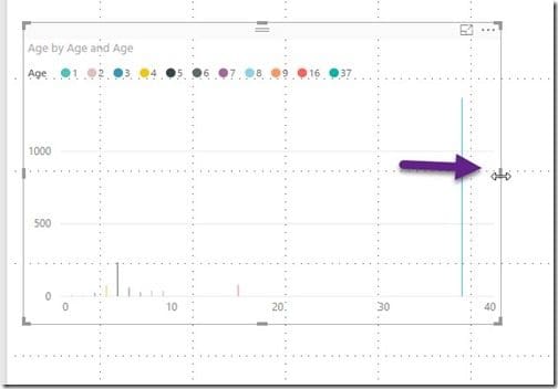
When you select the chart on the canvas you’ll see that there are items that you can point to, click on and drag. Using these features will change the size of your work area by making it either larger or smaller.
Why It’s Important to Get Your Query Right
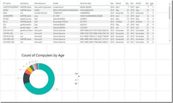
Accordingly, In the above table, I sorted the ages of the computers. If you take a look, you’ll see that there are four computers that are four-years-old.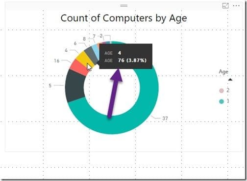
However, when I selected the 4-year-old donut wedge, in the image above, I got an unexpected result. Power BI automatically summed the results of my bad query and gave me a total age of 76!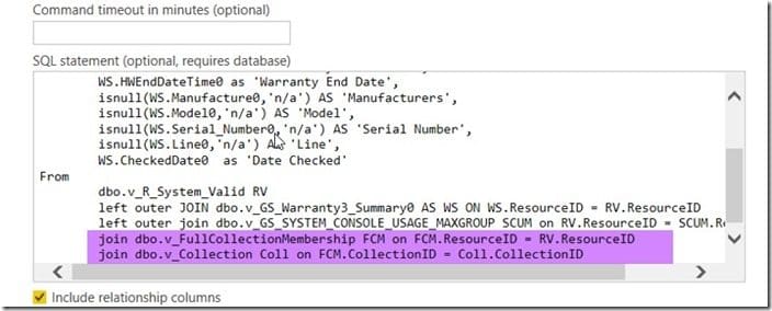
So what happened? At any rate, if you remember, back in the Getting Started with Power BI Desktop and SCCM post, I showed you a screenshot of my query. Earlier by accident I joined dbo.v_FullCollectionMembership and dbo.v_Collection together. I also did not include a Where statement to only show computers from a particular collection. Additionally, what this means is that the number 76 is the combined total of the computers with ages equaling “4” within all collections.
How do you fix it? In any case, as I explained in one of my previous posts, there are two ways to fix this problem. Firstly you could fix the original query, or the second method involves adding a filter to it. Below I will show you how to add a filter to the chart.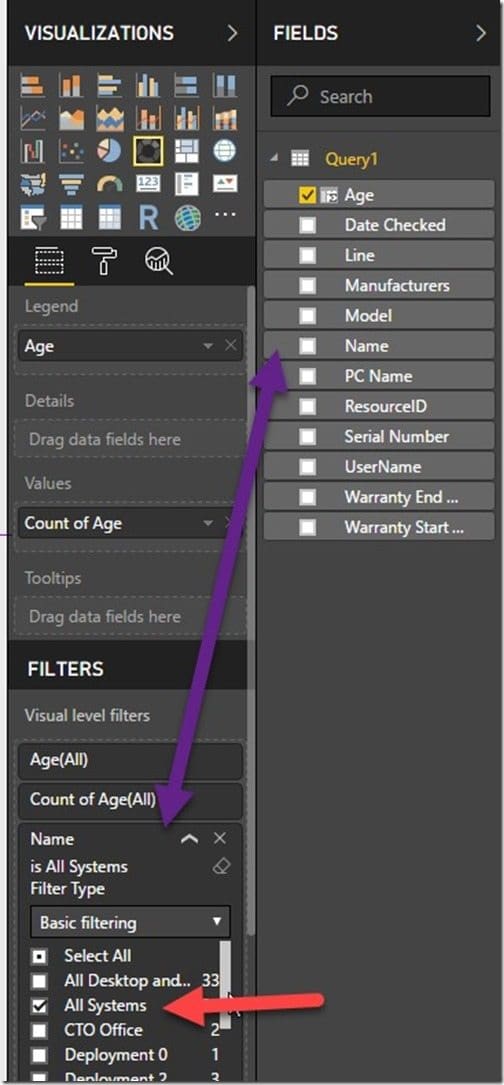
First, drag the Name (collection name) column to the Visual level filters section and then select the All Systems collection (red arrow).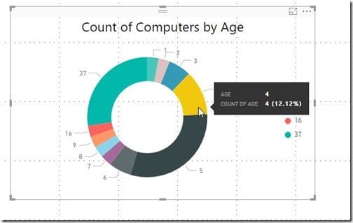
At last the 4-year-old donut wedge shows a count of 4 computers and not 76!
This is one of the reasons why it is always important to test your queries in order to ensure that they are correct. If you aren’t getting the expected results, then you need to troubleshoot in order to figure out what’s wrong.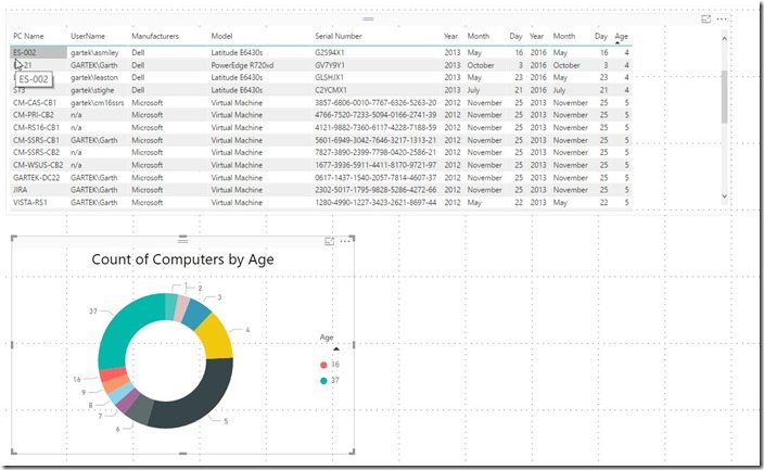
Do you feel like you’re done after adding a chart to your Power BI dashboard? If you’re like me you’ll know that there is so much more that you could do, but those changes will be topics for future blog posts!
Stay tuned because my next blog post will be all about color! Specifically I’ll show you how to apply color to items within charts and then I’ll compare my Power BI chart to a similar one that I created with SQL Server Reporting Services (SSRS).
At any rate, what else would you like me to post about for Power BI Desktop? In addition, if you have any suggestions, please feel free to contact me @GarthMJ.

