
Last updated on December 31st, 2023 at 10:44 am
While creating the videos for the GetColor updates. It dawned on me that I should show you how to Enhancing GetColor to add Defined Colors. To do this, I will show you how to define colors for a particular string value using the GetColor function.
DEFINE COLORS
Before getting started, let’s talk a bit about colors. I hope we can all agree that the color red is associated with words like, “danger,” “crisis,” or, “emergency.” While the color green is associated with words like, “good,” “safe,” and so on. Similarly, “neutral,” is represented by the gray or blue, and orange represents, “fair,” or, “just okay.”
It also makes sense to have colors assigned to an idea. Although this blog was originally created with the concept of Good and Bad. This update blog will work with the concept of ideas. At the end of the day both do exactly the same thing. I am using these color concepts when coding these colors into my report.
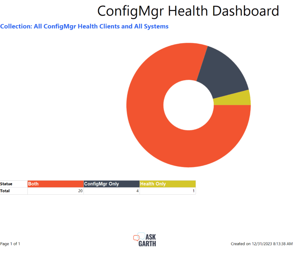
The dashboard, in the above image, displays information about ConfigMgr Client Health, e.g. the results of ConfigMgr client health – Anders Rødland startup script. Without defining any of the colors from my custom color palette with a particular value. All of the colors shown in the charts and tables above were randomly assigned by Report.
As you have likely notice by now, I’m using this dashboard to update all of my Color blogs and video. While working on the “Unleashing the Power of GetColor Advanced Techniques for PBRS Chart Customization” video, it dawned on my that I can’t stop my updates there.
I am going to focus on the chart and table which displays different system states: Both, ConfigMgr Only and Health Only. The concept is the same but instead of assigning green (#00ff00) for Good, I will use Green for “Both”. Why? Because Both in this case means that the device exists within ConfigMgr and Client Health. Now mutually (ConfigMgr Only & Health Only) mean a warning or error state. Now I can’t possibly use the same color for both of them. So, I have decided to use colors more closely linked to the products. Therefore I will use gray (#97989a) for Health Only and blue (#0468BF) for ConfigMgr Only.
HOW TO DEFINE COLORS FOR A VALUE
I turn to the GetColor function (as seen in How to Create a Color Palette for Your ConfigMgr Reports) to define these colors. How does this work? The answer is to use an If … Then … Elseif … Else statement within the GetColor function. These statements allow me to assign a color to each of the values listed above.
CODE
After adding these statements, this is how the function appears:
Private colorPalette As String() = {"#F25430","#404959","#D5C72B","#9C4D1F",
"#494C8C","#D0320d","#3C5956","#F23078","#3067F2","#F27630","#549D83","#F2309F",
"#D068B3","#F29830","#129AB8","#BF624C","#18C9F2","#D52B69","#A6F230","#FF9981",
"#D5692B","#D52B8B","#D5862B","#2B5BD5","#7db781","#B0D9D5","#F25430","#73D8B3",
"#91D52B","#9D6154","#2BD597","#DC7058","#B84025","#9C1F66","#9C621F","#814F44",
"#7988AD","#F2933D","#505A73","#E02BCB","#A41f00","#4e948d","#1309D9","#15E66F",
"#3E1F9B","#FF7858","#2DE0BC","#D58335","#ED77CC","#129AB8","#09632A","#A0264D"}

Private count As Integer = 0
Private mapping As New System.Collections.Hashtable()

Public Function GetColor(ByVal groupingValue As String) As String
	Dim c As String
	If groupingValue = "Both" Then
		C = "#00ff00"
	elseif groupingValue = "Health Only" Then
		C = "#97989a"
	elseif groupingValue = "ConfigMgr Only" Then
		C = "#0468BF"
	else
		If mapping.ContainsKey(groupingValue) Then
			Return mapping(groupingValue)
		End If
		c = colorPalette(count Mod colorPalette.Length)
		count = count + 1
		mapping.Add(groupingValue, c)
	end if
	Return c
End Function
If you were to do a comparison between the original color palette code’s function and this one, you would notice that the functions are basically the same. To force a particular color, use the If… Then logical operators match the string. When the string doesn’t match, it falls back to the automatically assigned color from the color palette.
AFTER DEFINING COLORS
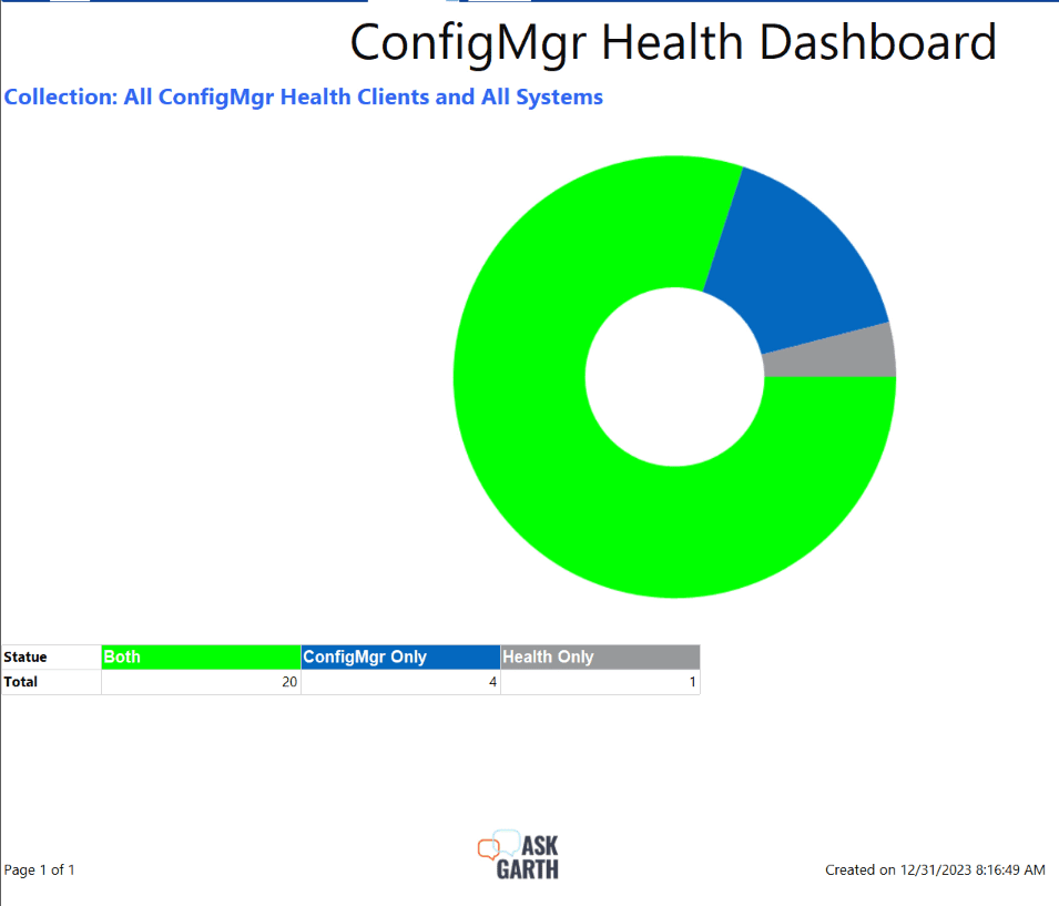
Finally, this is the end result after I customized the report’s properties to display specific colors in the last chart. Doesn’t it make it easier for the end user to see how their environment stacks up at a first glance? If you want consistency in your reports and to make your charts easier to understand, define what color is used when.
Enhancing GetColor to add Defined Colors Video
Watch as I preform the step-by-step within the video.
CONCLUSION
Use this important tip in order to make the end user’s life easier. I recommend enriching your reports as much as possible to make them more relatable. Let me know if you come across any other such tweaks, and if you have any questions about how to define colors. Please feel free to contact me @GarthMJ Please also subscribe to my YouTube channel and newsletter.
Bottom of Form