
Last updated on December 31st, 2023 at 10:26 am
This is final blog post in set for GetColor and Color Palettes. This set shows you how to create a color palette code. How to add it your RDL then how to use it in a chart. This post will show you how to perfectly matching colors in your report chart and table.
If you recall, I am using one of Ask Garth’s color palette codes with the GetColor function. That I first showed you in the post, How to Create a Color Palette for Your ConfigMgr Reports. Here I take that code and synchronize the colors in a chart and a table that are displaying the same details.
GETTING STARTED TO MATCH THE COLORS IN A CHART AND A TABLE
In this example, similar to last week’s post, How to Utilize Color Palette Function in PBRS for Stunning Visualization. I am using newly created report that will be the primary report for ConfigMgr Client Health set.
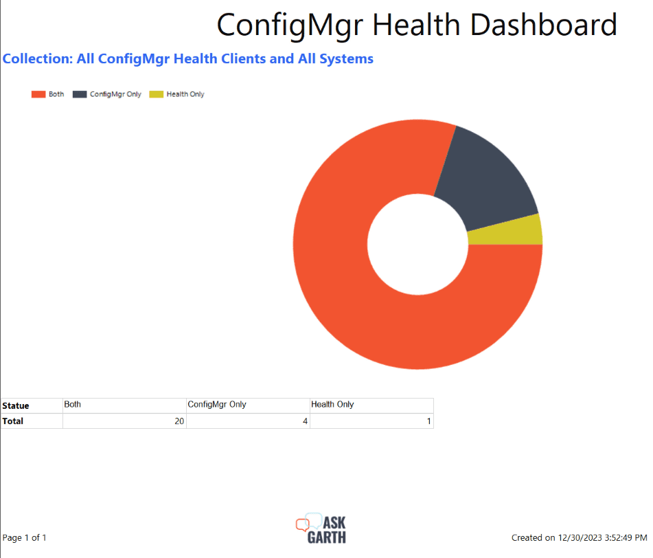
As you can see from the above image, on the first column list the ConfigMgr Client Health status. The next column lists the number of devices in that status. Wouldn’t it be easier if you could immediately see the highest count in the table similar to what you see in the donut chart?
HOW TO MATCH THE COLORS IN A SSRS REPORT CHART AND A TABLE
In order to make this report easier to read, I am going to add a column to the table. This new column will display the colors that are shown within the chart.
Note: The steps for a matrix are exactly the same as the ones for a table.
It might not look like we are starting from where we left off in the previous blog post, but we are soft of. The default color palette is shown when you are on the Design page. Your color palette is displayed at runtime. This is why you don’t see the custom color palette used in the last blog post.
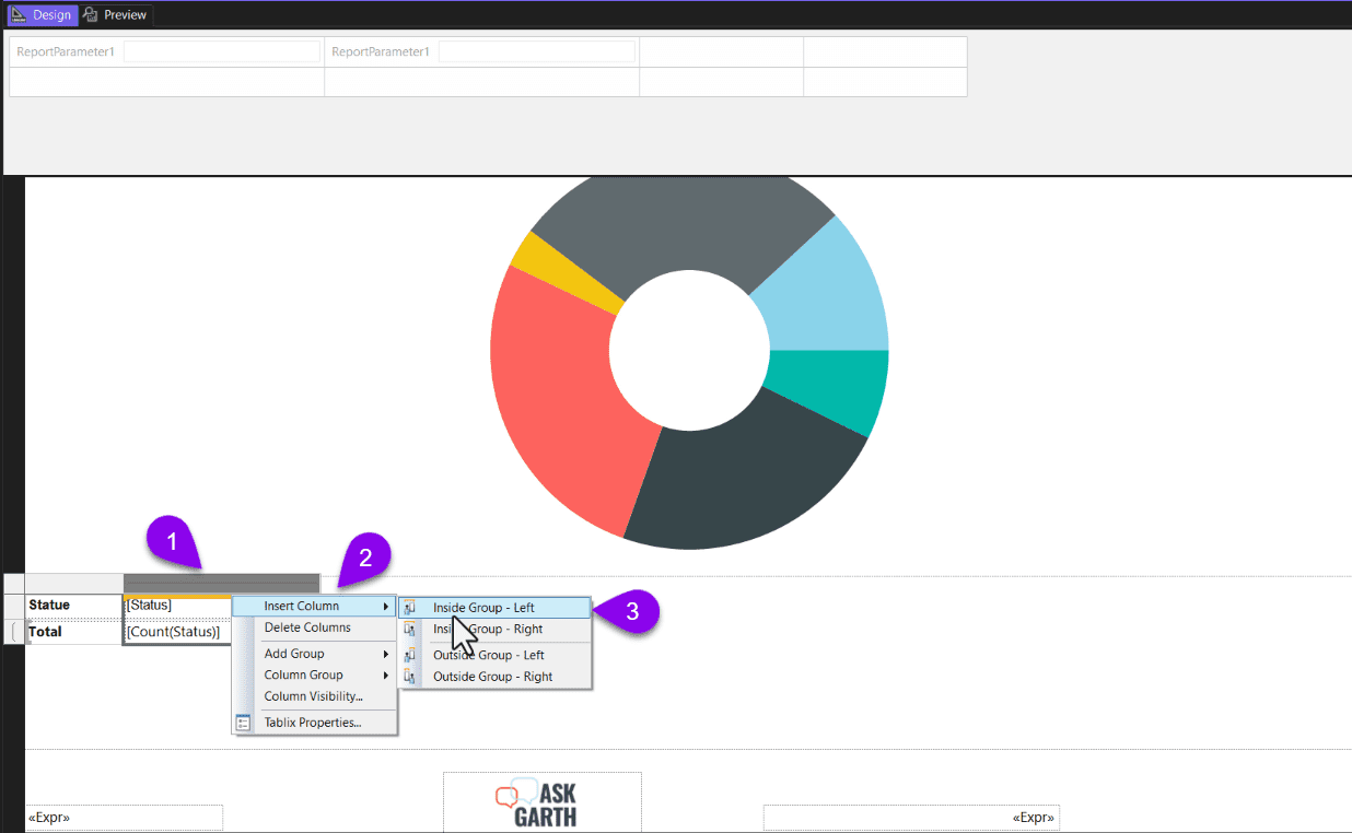
Starting from the Design page, highlight the table and then right-click on it (#1). Choose the Insert Column option (#2) and select which side you want the new column to appear. In this case, I chose the Left (#3) side.
The “Code”
=Code.GetColor(Fields!Status.Value)As a reminder, this expression for the GetColor function was used for the chart in the “Unleashing the Power of GetColor Advanced Techniques for PBRS Chart Customization” of this set. Before using the expression, I added my custom color palette code to the report. Now, by using the same expression as the one within the chart. The colors in the table and the chart now match.
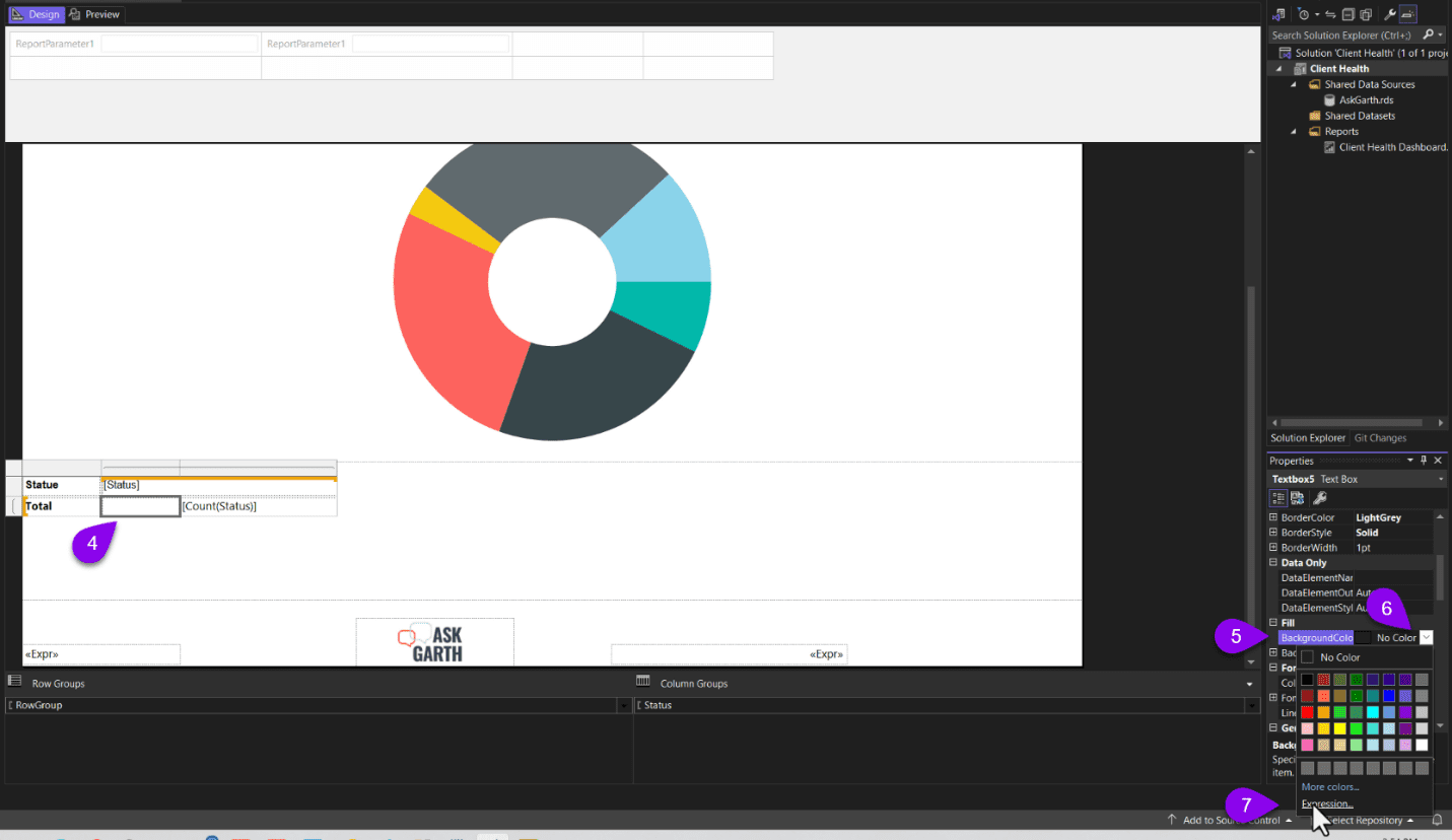
Start by highlighting the cell (#4) where you wish to see the background color. On the right-hand side of the page, under Properties, look for BackgroundColor (#5) and click on the drop-down menu (#6). Next, select Expression… (#7).
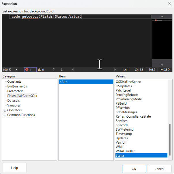
In the Expression window, I copy the same expression that I used within the chart and click OK.
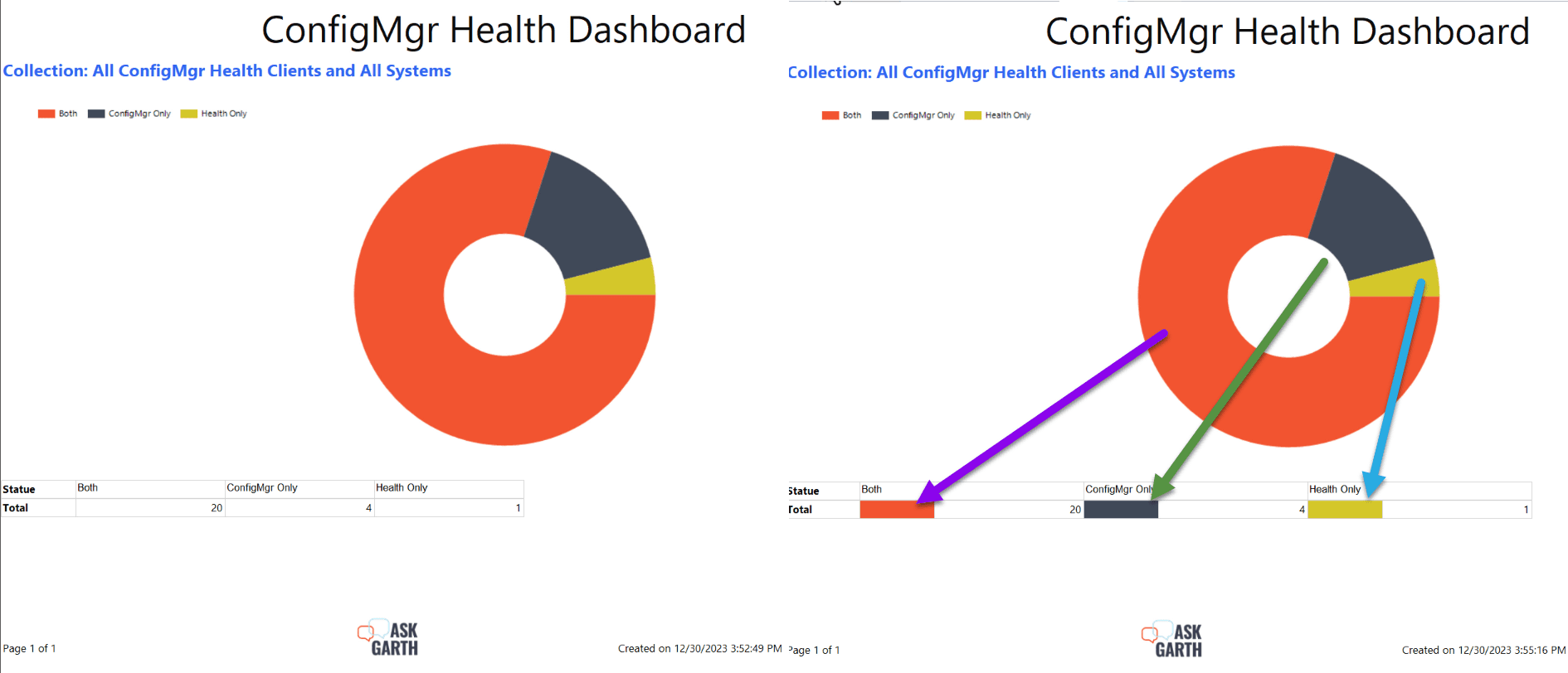
The above image compares both reports before and after the expression was added. Wouldn’t you agree that the second report is a better way to display the same results? When I look at the updated report, I can immediately spot the colors. I know exactly where to look in the table for more details.
Tips for Perfectly Matching Colors in Your RDL Chart and Table Video
In the video, I show these step as I have defined them above. But I have also showed a second method Colorizing the Header section to show the same details.
SUMMARY
This completes the Color palette and GetColor blog post-series. From understanding the color palette code, configuring the chart properties to use the color palette function. Finally, perfectly matching colors in your rdl chart and table. Using these tips can help make your reports easier to read too!
You can be certain that all of Ask Garth reports and dashboards make smart use of color in order to convey complex data in an instant! Let me know if ya’ll have tried anything similar and how it worked out for you. If you have any questions about tips for perfectly matching colors in your RDL chart and table. Please feel free to contact me @GarthMJ Please also subscribe to my YouTube channel and newsletter.