Last updated on April 27th, 2024 at 09:39 am
Why am I talking about Power BI Desktop drillthroughs? Don’t you just click on an item and it drills through to the next page? Isn’t it just like drilling through items in SQL Server Reporting Services (SSRS) reports? The answer is an emphatic, “No, they are not like SSRS drill throughs!” In this blog post I show you how to use Power BI drillthroughs, but first, what is a Power BI drillthrough?
What Is a Power BI Drillthrough?
Similar to a SSRS drill through (which is two words in SSRS) a Power BI drillthrough enables you to move from one report to another report.
The big difference between Power BI Desktop drillthroughs and SSRS drill throughs is that Power BI filters the existing data in order to display a report. Whereas SSRS runs a query (at run time) to get the data first before displaying it in a report. As a general rule, Power BI collects all of the data (imports it from SCCM) when you first start using a report. This process means that it is slower at the beginning, but then faster than SSRS once you get started. The results (data) from the first Power BI report are filtered and then displayed in the next report, or as you’d say in Power BI, the next page.
Here’s an example of when you would want to add a drillthrough to a Power BI dashboard: you designed a dashboard that gives a high-level overview of your software update (SU) compliance, but now you only want to see what computers don’t have a certain SU installed. I actually created such a dashboard for Enhansoft Reporting, so I will use it in my demonstration.
How Do Power BI Drillthroughs Work?
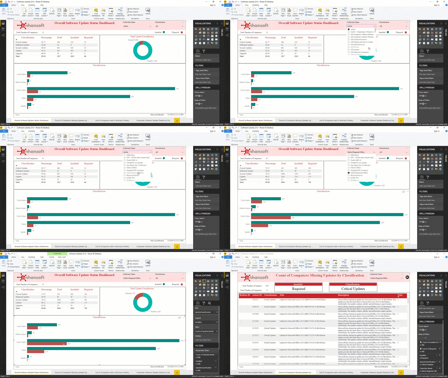
Below is a step-by-step break-down of how a Power BI drillthrough works. Later on in this post, I included a GIF to show you exactly what I mean.
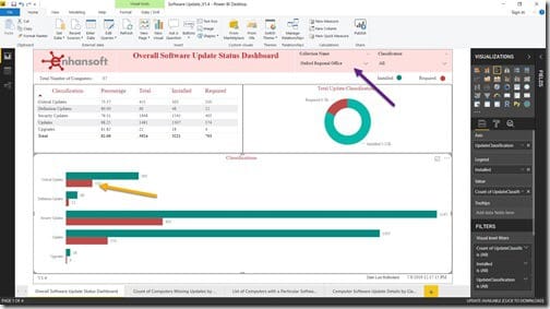
In this example, I am using Enhansoft Reporting’s Software Update Power BI report set. I am looking at what critical SU’s are required for the Oxford Regional Office collection.

Starting on the main page, I right-click on the Critical Updates required bar (see the yellow arrow). By the way, the purple arrow is pointing to the collection slicer where I already selected the Oxford Regional Office.

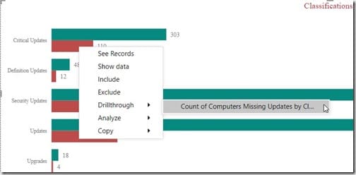
Right-clicking on the Critical Updates bar reveals a popup menu. Next, I select Drillthrough and then I choose the appropriate report page. In this case it is, Count of Computers Missing Updates by Classification.

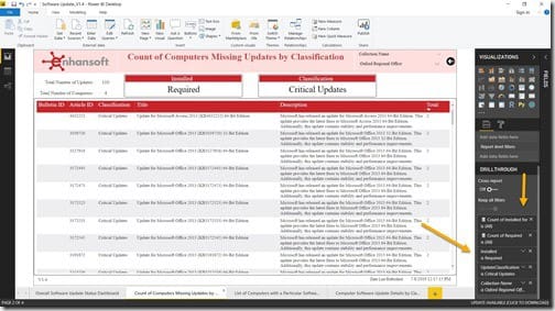
This takes me to the report page I want. I can clearly see (in the top left of the page) that four computers in the Oxford Regional Office need 110 updates installed.
Next to the report, on the lower right-hand side (see the yellow arrows) all of the page filters are listed. These are the filters responsible for what is displayed on the page. If you adjust them manually, the results on the page are automatically updated.

As promised, above is the GIF animation of the whole process.
How Do You Create a Power BI Drillthrough?
Not too worry! This is a fairly simple undertaking. All you need to do is to create a page level filter for a column. My colleague, Leonard Suares, wrote a step-by-step blog post that shows you how to perform this task. The blog post is called Power BI Filters.
I also published a blog post entitled, Power BI Filters and How to Change Them. In that blog post, I show you how to reset a page level filter to display different results on the report page without having to return to the main page and selecting another option(s).
If you have any questions about Power BI drillthroughs and how to use them, please feel free to contact me at @GarthMJ.
