Last updated on July 23rd, 2022 at 11:02 am
Hi All! This is what I call an interesting blog post. All report developers, at one time or another, wish they could customize reports to their own liking. It could be as simple as adding a department name, a project name or a company name to a SQL Server Reporting Services (SSRS) report. I too had that, “I wish,” moment. I wished to add the Enhansoft company logo as a marker on a line chart. This was an interesting challenge (that’s why I call this an interesting blog post!) so I thought you might also want to see how to customize SSRS line chart markers.
“I Wish” Moment
When developing reports, here at Enhansoft, we consider a number of factors, but most importantly, whatever we implement, we want our reports to be helpful to our customers. The end result needs to make sense. While I was working on a new Warranty Information Reporting (WIR) checkdate report, which is basically a line graph showing when a computer’s warranty was last checked against Enhansoft’s Warranty Status API, I had this, “I wish,” moment.
Up until now, the warranty checkdate data was not visible within any of our reports, but based on customer feedback, we wanted to create a new line chart showing them when computer warranties were checked over a date range. A little further below in this post is the first draft of the report we had in mind. When I reviewed this report with our Chief Architect, Garth Jones, we joked about adding the “E” (![]() ) from the company’s logo as a marker on the peaks and troughs. Did I tell you it was a Friday? Anyways, I wanted to see what it looked like, so I did it!
) from the company’s logo as a marker on the peaks and troughs. Did I tell you it was a Friday? Anyways, I wanted to see what it looked like, so I did it!
This blog post gives you the step-by-step instructions on how to do this and I would LOVE to hear what you think about me using the “E” as a marker.
How to Customize SSRS Line Chart Markers
Now in the real world, why would you do this? There is no wrong answer to this question. Customizing charts and visuals, in general, allows the report-user to connect to it right away. You could use your company’s logo, similar to what I did, or if you wanted to show the amount of soda sales in your graph, why not use a soda can to show the peaks?
Before
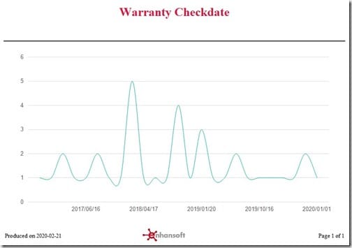
This is how the report originally looked with the line chart default settings. In the above image, you can see the number of computers and the warranty checkdate information. Below are the steps I took to customize SSRS line chart markers in the Warranty Checkdate report.
Adding the Image to the Report
First, I grabbed the “E” logo from our source files and re-sized it to 15 x 13 pixels (width x height) on the image editor application (I used Snagit) and saved it as a JPG file.
Once the image you are going to use is ready, open your report in Visual Studio. Next, I show you how to import the image to Visual Studio.
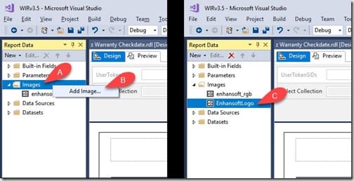
On the left side of the page, under the Report Data pane (as shown above), search for Images (A). Right-click on the folder and select the Add Image… option (B). Choose the file you want to use. Once done, the image file is displayed under the Images section (C). Now the image is imported and ready to use in any expression or visual (a table or a tablix).
Updating the Chart
Let the customization of the chart begin!
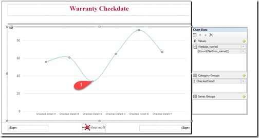
Start by highlighting the chart series (1) used in the line chart.
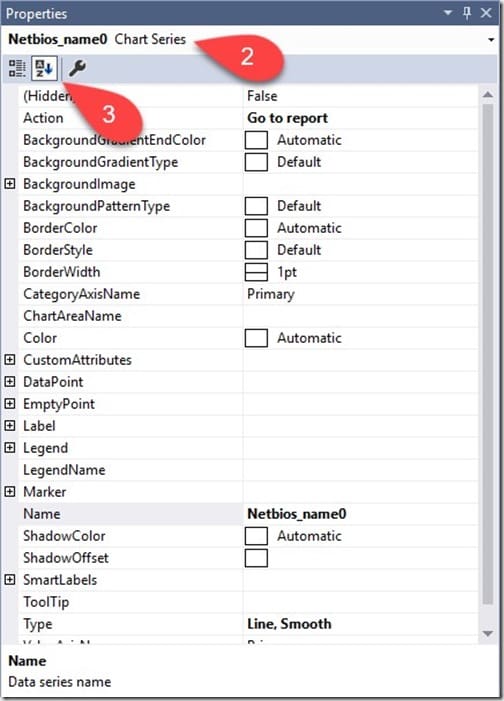
When the chart series is highlighted, all associated properties for that series open up at the bottom-right of the screen. Above, you can see the chart series properties (2). In order to easily find the settings I wanted, I sorted them alphabetically (3).
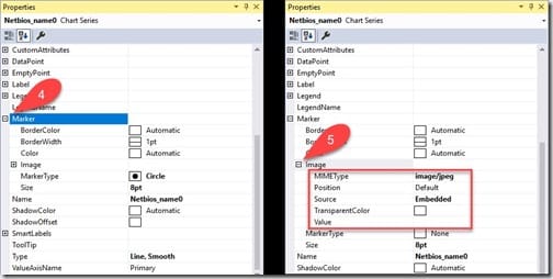
Next, look for the Marker setting and click on the expand icon (4). Find the Image option and click on the expand icon (5) next to it. This is where you customize the marker image.
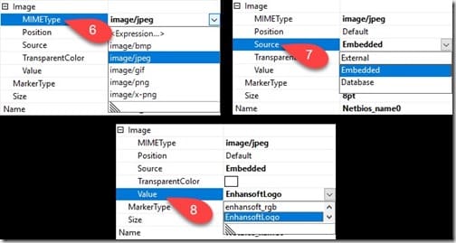
At this point, I selected the MIMEType (6) as a JPG file because that is the file type of the image I imported. Then, I selected the Source (7) as Embedded because the image file is embedded within the report. Finally, I selected the Value (8). The value is the image itself (EnhansoftLogo). Once I completed these steps, the updated markers immediately appeared on the design pane.
After
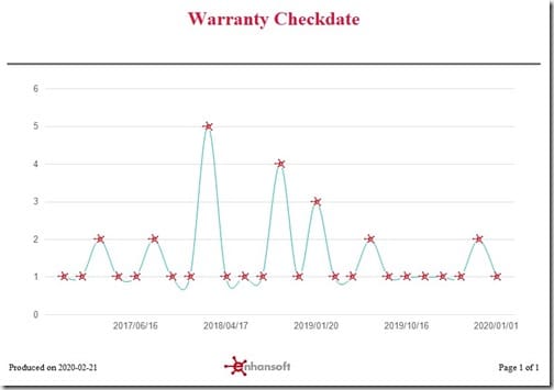
Make sure you click on the preview option in order to verify the customization. The above image is the end result I was hoping to get. Isn’t that great? The customized chart markers really help to spotlight the values of each data point. If you have ever worked with line charts, you know that the standard options for markers are uninspiring, so why not have some fun with it?
Conclusion
The power of SSRS and what you can do with it amazes me. Using this idea allowed me to make this report original. I also think this customization creates an instantaneous connection with the report user and it definitely gives a better report experience. I hope y’all find your own ways to come up with great customizations for your customers or colleagues. If you have any questions about how to customize SSRS line chart markers, you can reach out to me on Twitter @SuaresLeonard. Till then, good luck.
