Last updated on August 6th, 2022 at 04:02 pm
Why is it important to know the difference between report styles? You need to know what style is best in order to display SCCM data properly.
Reports come in many different shapes and sizes, but the five styles I’ll talk about in more detail later on in this post are:
– Dashboards
– List Reports
– Detail Reports
– Scorecards
– Choropleth Maps
Whether you are using Power BI or SQL Server Reporting Services (SSRS) to create your reports, there are some key factors to consider.
One of the biggest mistakes I see a lot of in my line of work is folks trying to put too much data on one page. You need to focus on a specific area of concern and then break things up into smaller chunks. Don’t take my word for it. Check out the default reports within System Center Configuration Manager (SCCM). Reports tend to come in sets of three. The first report generally shows you a specific area of interest at a high-level. From the first report you can drill-down on one aspect to get more details. Then from that second report you can usually drill-down to get more information on the same area of interest about a specific computer.
Report Sets
Different report styles can be used for each report within a report set. There’s no rule saying you have to have only list reports in a set. For example, you can start with a dashboard and drill down to either a list report or a detail report for one aspect of the dashboard.
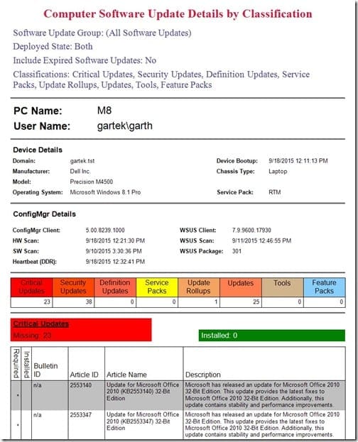
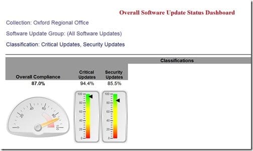
I always think patch status is a great example for a report set. First you want to see your overall compliancy rate. Next you want to look at which computers are not compliant. Lastly, you want to see software update details for a particular computer. At least this is what I want to see!
Could you put all three reports into one dashboard? Sure, but if you only want to build one dashboard in order to save yourself the time and trouble of creating additional reports, then you really aren’t doing yourself any favors. In reality it might take even longer because you will need to adjust the interface to display the details in a super-organized, uncluttered, and meaningful way. Whereas, if you create three reports around a clearly defined topic then each report can stand on its own.
Something also to consider, if you put all three reports into one dashboard you could affect the performance of the dashboard itself. Either the dashboard takes forever to render or, worse yet, it has an adverse effect on the performance of SQL Server.
Report Style Choices
Why would you opt to use one style over another?
I’ve thought about this for a very long time (probably longer than I should!), but the short answer is that all reports, no matter the choice, must display the information in a clear and uncluttered fashion that doesn’t overwhelm the report’s reader with too many details.
At the outset you need to pick a focus area.
You must also decide if you need a visual aid. Would the reader benefit from seeing a pie chart, a donut chart or a choropleth map?
Is there a wrong answer to this question? I don’t think so.
These are some additional factors to consider when you first start thinking about the kind of report you want to create:
-Will the report take over 15-minutes to generate?
-Will the text be easy to read?
-If you’re not producing a report based on SCCM data, then you can consider if your report will be in real-time or if it will be about a point-in-time.
If you are not the originator of the request for a new report, you need to carefully consider what information is being requested. You may need to revise the original request in order to build logical and meaningful report sets. For example, why would you need to know the IP address of each computer if the main purpose of a report is a software audit? The information about IP addresses could be listed in an off-shoot of the main report set which would obviously be very helpful to the Service Desk as they start to redeploy software.
Report Styles – Dashboards
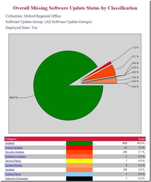
Dashboards tend to have one or more visual aid; additionally, they sometimes use tables to help explain the data being shown. They are intended to give the reader a quick report on a clearly defined topic. For example, how many software updates, by classification, are installed versus not installed?
Report Styles – List Reports
List reports tend to be a drill down report from a dashboard, but they can also stand on their own. Usually in a table format, this type of report provides more information about a particular item that is mentioned in the dashboard. These reports are great because they can answer more specific questions such as, “Which computers need a particular software update?” or, “Which computers are not compliant?”
Report Styles – Detail Reports
Although these reports are not that different from list reports, a detail report tends to provide even more information about the clearly defined topic area. For example, it can provide a list showing all of the software updates on a computer. These reports are excellent at answering this type of question, “I know this computer is missing software update KB 3164398, but what other software updates is it missing?”
Report Styles – Scorecards
At a basic level, a scorecard is another type of dashboard. Generally a scorecard differs from a dashboard by measuring your environment against a set threshold. Such as a Service Level Agreement (SLA) value. These types of reports can help to ensure that SLA values are met by letting you know when more effort is needed. For example, if after 24-hours, 85% of all computers must be updated with the latest software as per the SLA. The scorecard displays the color green when this target is reached. When the number of updated computers, however, is between 85% and 75% the color is yellow, and below 75% the color is red. You know right away if you need to take immediate action.
Report Styles – Choropleth Maps
Choropleth maps tend to display a number of values in an area on a map. For example, this report style could show you how many computers are missing two or more software updates by postal/zip code or city.
Hopefully this gives you a better understanding about the different report styles available to you. No matter your SCCM reporting needs, however, you can always turn to Recast. We’ll help you find the right fit for your Business Intelligence (BI) needs with our insightful and easy-to-read reports. Talk to us first to see how we can help with your reporting challenges.
If you have any questions about different report styles, please feel free to contact me @GarthMJ.
