
Last updated on December 31st, 2023 at 10:50 am
This blog is the continuation of “How to Utilize Color Palette Function in PBRS for Stunning Visualization”. I will show you how to unleashing the power of GetColor advanced techniques for PBRS chart customization. Thereby allowing your report to be on brand.
If you recall, I showed you one of Ask Garth color palette functions GetColor. In that post, explained how the function works. I also showed you how to add the code to a report.
PBRS vs SSRS
This is as hard one to explain but PBRS reports created with VS will actually be SSRS reports. And they can be used on either SSRS or PBRS. In PBRS they will show up within the paginated section within the folder. So even though I use PBRS thru this blog, everything applies to SSRS too.
WHY USE YOUR OWN COLOR PALETTE?
The answer is simple: make the information displayed in a report to be “on brand” and is easier to read. One of the ways you can make reports easier to read is by matching the colors between a chart and a table. In order to do that you need to use a function and a custom color palette. Without those two items it is impossible to match the colors between the two objects within PBRS, but more on that later, in next week’s blog post. This post is all about how to use the GetColor function within a chart.
At Ask Garth, we follow a specific report sequence format and all of our “count” and dashboard reports usually display data in a chart associated with a table. The chart gives you a graphical representation of the data and the table below shows the values found in the chart.
You might be wondering why we use a table/matrix instead of a legend to explain the chart’s visuals. Doesn’t a table take up extra space? If your SCCM/ConfigMgr/MEMCM environment is in the hundreds or hundreds of thousands of computers, this could lead to hundreds of rows in a legend, so you’re not really saving any space. Also, legends tend not to display totals in a nice format, but tables, on the other hand, can be formatted to include more details, make better use of the space on a page, and make it easier for drill throughs. Really have better control of everything.
There are many decisions you need to make when it comes to designing reports. The first one is usually deciding what type of report style to use. Would you like to learn more about the different types of reports? Please see this post, What Are the Best Report Styles for SCCM?
Now, let’s get back to our main topic.
BEFORE THE GETCOLOR FUNCTION IS ADDED
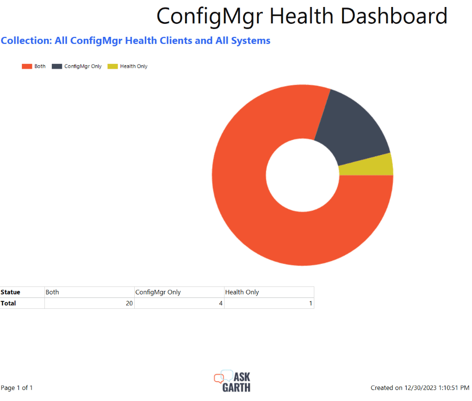
Below is an example of a report that is using PBRS default color palette. In this example it is using the Pacific color scheme with a red base.
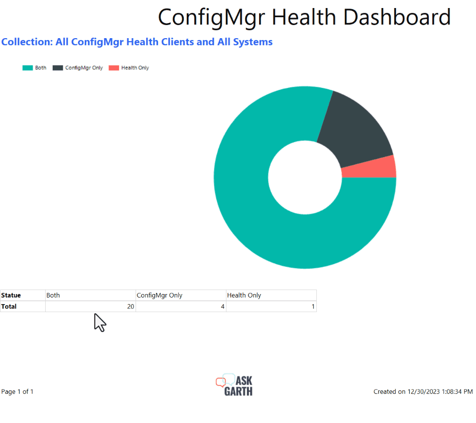 It’s easy in this simple chart and table to know which column corresponds with what value in the chart. But what if I told you that you could make it even easier?
CODE
Now that the GetColor function is within the RDL. We can leverage it within our report. See “How to Utilize Color Palette Function in PBRS for Stunning Visualization”, if you haven’t imported the function yet.
But how can we use the GetColor function in a chart, table/ matrix? It must be prefaced with Code. (see example below).
=Code.GetColor(<column name>)Let’s use GetColor function within the chart.
ADDING THE FUNCTION TO A CHART
Make sure your custom color palette code is already added to your report before proceeding to the next step.
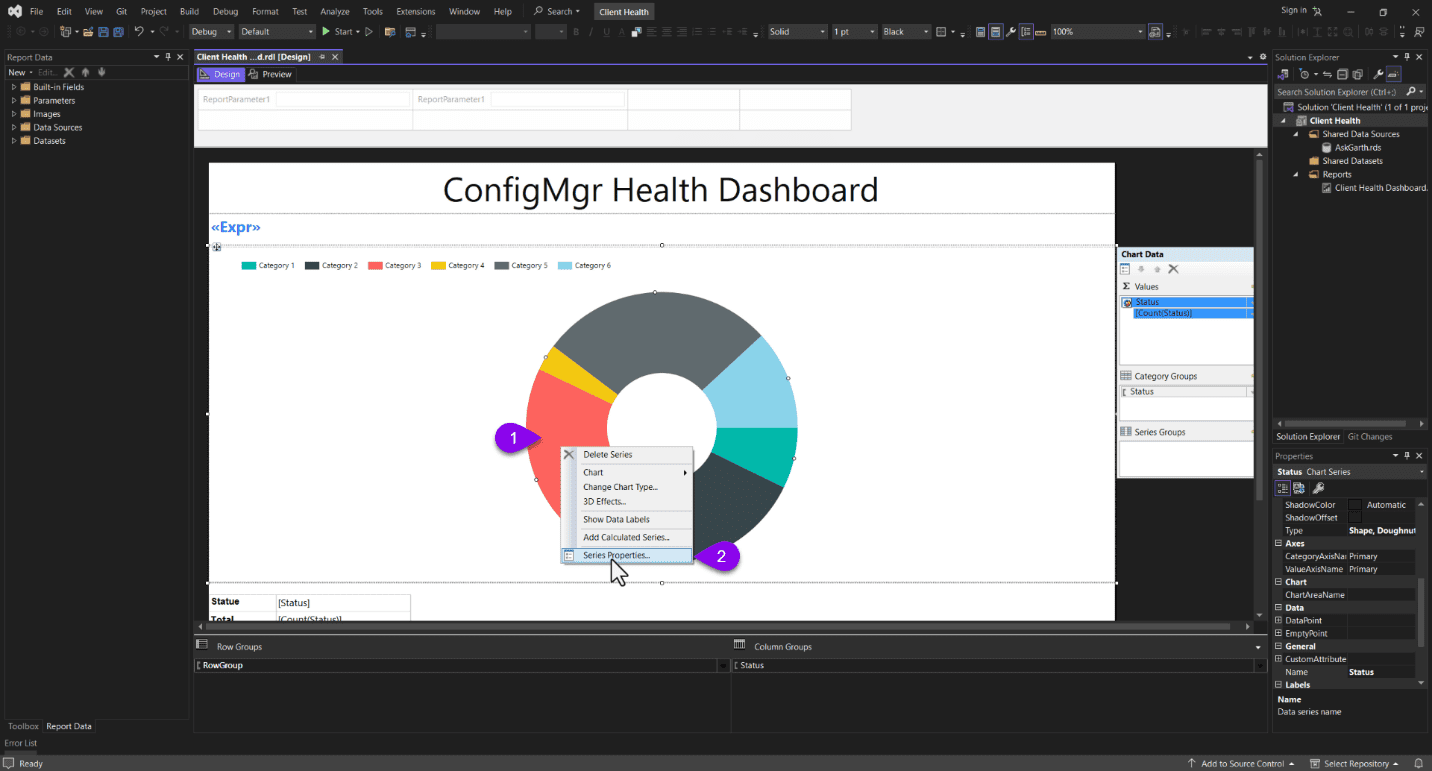
Select one of the donut wedges in the chart by right-clicking on it (#1) and then select Series Properties… (#2).
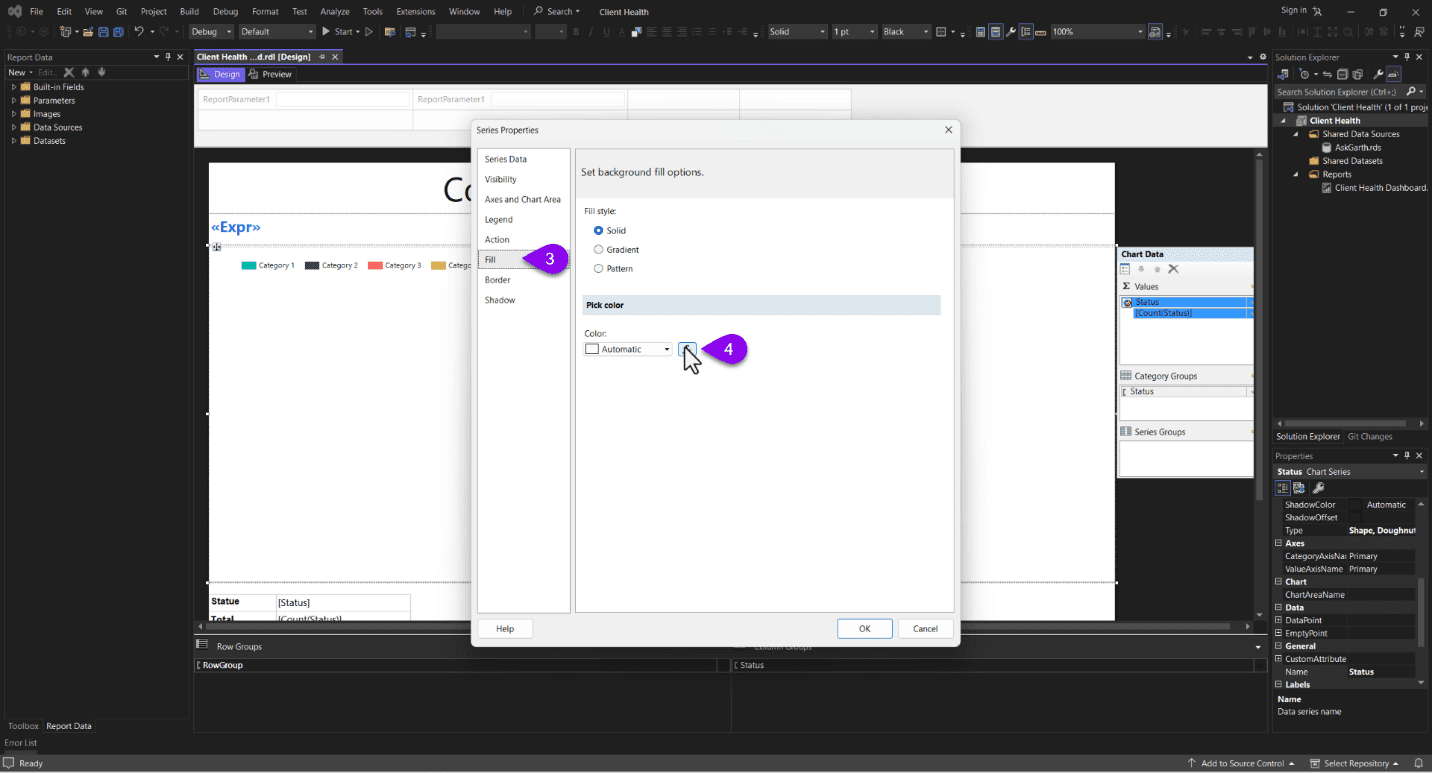 In the Series Properties window, select the Fill node (#3) and then select the function button (#4).
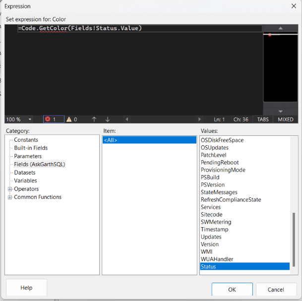
Next, paste =Code.GetColor in the expression window. Notice that I’m passing the Fields!Status.Value to the function which will define the color for that column value.
Click on the OK button twice in order to close the open windows and return to the design tab. At this point you are done but it is test to test it to make sure that everything is correct.
AFTER THE GETCOLOR FUNCTION IS ADDED
As you can see from the screenshot above, after using the GetColor function with our custom color palette. The report is becoming easier to read and understand, but we’re not finished. Next week, “Tips for Perfectly Matching Colors in Your RDL Chart and Table” post, I will show you how to synchronize/match the colors in a chart with a table.
Unleashing the Power of GetColor Advanced Techniques for PBRS Chart Customization Video
This is the accompanying video that will show you the steps that I have taken.
If you have any questions about GetColor Advanced Techniques for PBRS Chart Customization. Please feel free to contact me @GarthMJ Please also subscribe to my YouTube channel and newsletter to stay on top of the latest trips and tricks.