Last updated on August 6th, 2022 at 04:02 pm
The default SQL Server Reporting Services (SSRS) reports in System Center Configuration Manager (SCCM), let’s face it, are plain. When you create a custom dashboard or report, however, they don’t have to stay that way! In this blog post I’ll show you how to update the plain SSRS gauge. Who wants to hear from their boss that a dashboard’s gauges look plain? With only a few simple changes your gauges will look better in no time!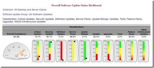
Take a close look at this Overall Software Update Status Dashboard (the final version is within Enhansoft Reporting). I deliberately made every gauge different. Can you tell what I did?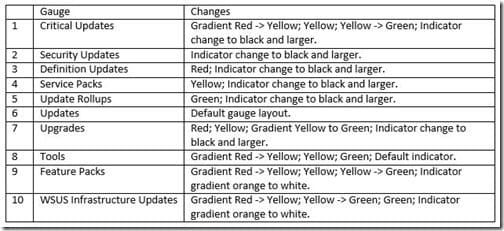
This table’s explanation of the gauge changes I made might seem confusing, but I hope that once you see how I changed these items, it will become clearer.
Gauge Parts
There are lots of parts within a gauge that can be changed, so it might seem overwhelming at first.
In this blog post, I’ll show you the changes I made to the Critical Updates gauge (gradient red -> yellow; yellow; yellow -> green; indicator change to black and larger). Below is a short description of each part.
Top Third
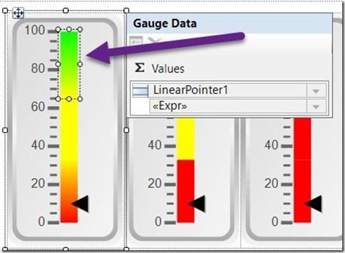
The purple arrow is pointing to the selected box that I like to refer to as the, “top third,” of the gauge. This part can be a different color than the other two-thirds of the gauge.
Middle Third
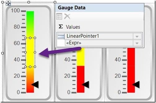
The selected box shows the, “middle third,” part of the gauge area.
Bottom Third
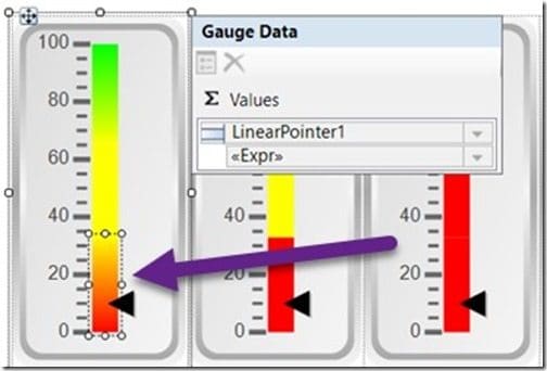
Above is a view of the, “bottom third,” part of the gauge.
Indicator/Pointer
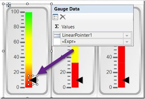
The indicator (or pointer) is often the most overlooked gauge part. The purple arrow is pointing to the selected indicator part.
How to Update the Plain SSRS Gauge
Now that you know the different parts of a gauge, I will show you, step-by-step, what I did to change the parts.
Background Color
In this section, I’ll show you how to edit the background color of the top and bottom thirds. This is important because you’ll want the color to gradually move from green to yellow to red. Remember, in the final version of this report, the middle gauge part stays yellow.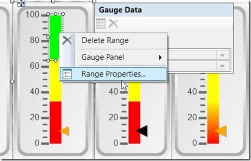
Start by selecting the third that you want to change. In the screenshot above, I’m selecting the, “top third,” part. Notice that it is only one color, green. Next, right-click and choose Range Properties…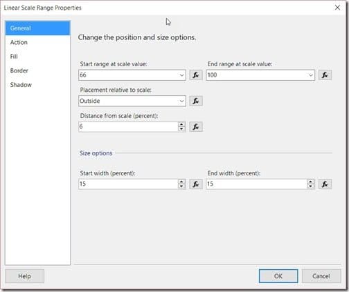
On the Linear Scale Range Properties page, select the Fill node.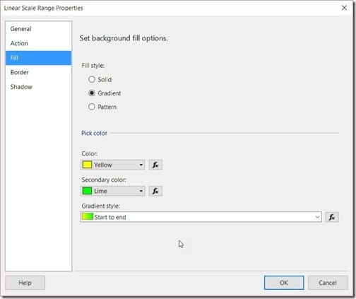
Next, select the Gradient radio button. This will allow you to then select the two colors of your choice.
Since I’m working on the top third part of the Critical Updates gauge, my colors must go from Yellow to Lime (Green).
Leave all other options as is, and then click OK.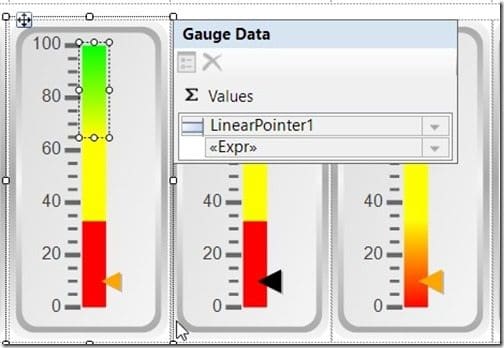
Notice that the top third part of my Critical Updates gauge now gradually moves from yellow to lime (green).
For the middle third part of the gauge, I will make no changes. It will be left as is.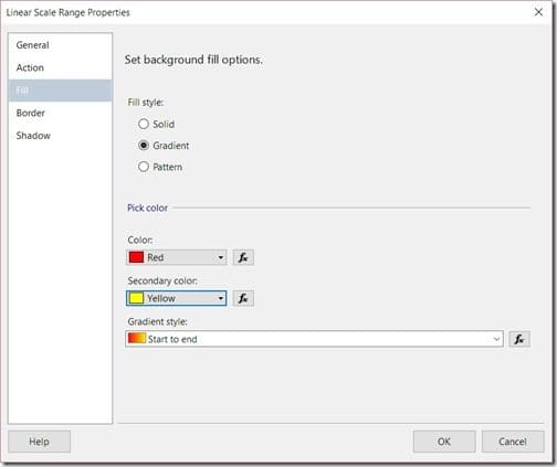
Finally, I will select the bottom third part of the gauge. Following the same steps, I will change the colors to Red and Yellow. The background color of the gauge is done!
Indicator/Pointer
In this section, I’ll show you how to edit the indicator (pointer) by changing its color and increasing its size.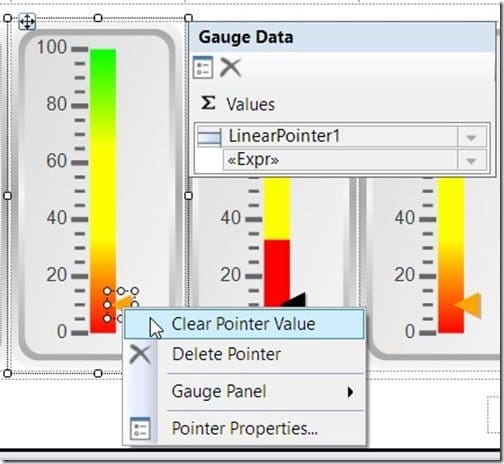
Start by selecting the indicator, then right-click and select Pointer Properties…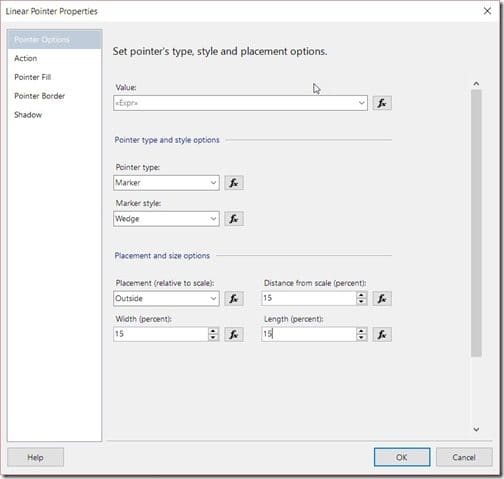
On the Linear Pointer Properties page, first change each of the following items to 15:
-Distance from scale (percent)
-Width (percent)
-Length (percent)
Once completed, select the Pointer Fill node.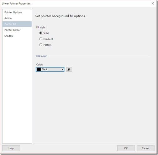
Change the Color to Black, and then click on the OK button.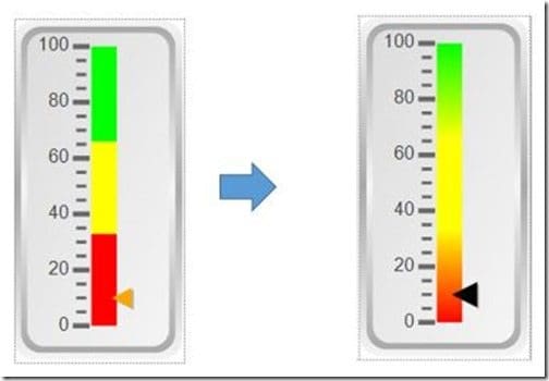
With this last step completed, you have taken your boring gauge and brought it to life by making it easier to read!
Below is the finished product after I performed all of the above steps for each gauge in the Overall Software Update Status Dashboard: Notice that note so plain SSRS gauge!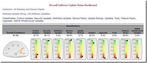
If you have any questions, please feel free to contact me @GarthMJ. Do you have an idea for a blog post about a ConfigMgr query or reporting topic? Let me know. Your idea might become the focus of my next blog post!
